Custom VGUI
From GMod Wiki
| Lua: Custom VGUI |
 Description: Description: | To help the the unknowing learn VGUI. |
 Original Author: Original Author: | Joudoki |
 Created: Created: | 4th August, 2007 |
Contents |
Primer
Alright, so you want to use VGUI in your mod for Garry's Mod. It's not as hard as you think - once you get an idea of the basic framework that goes behind creating a custom control, as well as the functions available at your disposal to aid in this process, you should be able to reproduce any control.
Note, that there are two ways to write controls; You can write highly specific controls that serve a special purpose, or you can write highly reusable controls; This tutorial series focus on the latter. However, you should be able to figure out how to make special purpose controls from knowing how to make reusable controls.
Prerequisites
Before you learn how to create VGUI objects, you should know how to use them.
Also, you should know how to use the draw and the surface libraries:
Let's consider how the control system works; the creation and the use of an object are completely separate; think of the definition of the control as a caste, and the use of it as when we fill that caste with some molten metal. We end up with a copy of the caste after all is said and done. Just as you wouldn't blacksmith on the cast of an anvil, you don't use the caste of a control when you use it; you make a copy, and use that.
Creating Controls
Now, on to creating controls. To start, let's take a look at this graphic from the Source Wiki:
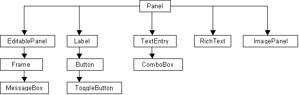
Now, you'll notice that the simplest object ( the Panel object ) is at the top, and the more complex objects are at the bottom. If you start from the bottom and follow the lines up, you'll see shared functionality, all the way back up to the top object that all these objects are derived from. By taking one class and reusing the code used in it, we can write controls without having to redo everything before it.
From the panel, which we will base all of our controls are derived from, we get the following properties:
SetPos( x, y )
SetSize( width, height )
SetParent( parent )
These are the most basic functions that we will use to define a control. Starting from there, we can add functionality.
Controls
Label
Code
So, the first thing that we will probably want to do is to make a label. The label control just displays text; to meet this end, we need a couple of helper functions. Let's start by making a basic structure for our custom control:
cLabel = {}; -- We need a table to define and store our custom control in.
cLabel.Text = nil; -- The text we are displaying
cLabel.TextAlign = nil; -- How to align the text; 0 means left, 1 means center.
cLabel.Font = nil;
cLabel.Color = nil;

-- Initialize function; this is called when the object is created
function cLabel:Init()
  -- Inside these functions, we use self.(property), because we are referencing
  self.Text =""; --
  self.TextAlign = 0; -- unless otherwise specified, we will want to align left.
  self.Font = "ScoreboardText"; -- This is our default font
  self.Color = Color( 255,255,255,255 );
end
function cLabel:Paint()
  -- This is where we do all the painting.
  return true; -- Returning true tells the renderer that it doesn't need to call the Paint() function of the object that we derived this object from.
end

-- Properties
-- Here, we are basically making it so that instead of accessing the variables directly,
-- we are making it so that we can check to make sure that the value is valid for what
-- we are setting. Also, if you need to use it with a timer, you can use these instead of
-- creating other functions.
function cLabel:SetText( text )
end
function cLabel:GetText()
end

function cLabel:SetAlign( align )
end
function cLabel:GetAlign()
end

function cLabel:SetFont( font )
end
function cLabel:GetFont()
end

function cLabel:SetColor( color )
end
function cLabel:GetColor()
end

vgui.Register( "cLabel", cLabel, "Panel" );
Now, this is just the framework; if you tried to use this right now, you wouldn't really get anything useful. Now, let's go ahead and fill in the functions in the properties section:
function cLabel:SetText( text )
  self.Text = text; -- Make sure that you're using self!
end
function cLabel:GetText()
  return self.Text;
end

function cLabel:SetAlign( align )
  if ( align == 0 || align == 1 ) then
    self.TextAlign = align;
  else
    Msg( "Invalid align [" .. align .. "] passed to control!\n" );
  end
end
function cLabel:GetAlign()
  return self.TextAlign;
end

function cLabel:SetFont( font )
  self.Font = font;
end
function cLabel:GetFont()
  return self.Font;
end

function cLabel:SetColor( color )
  if ( string.lower( type( color ) ) != "color" ) then
    Msg( "Invalid color passed to label!\n" );
    return false;
  else
    self.Color = color;
  end
end
function cLabel:GetColor()
  return self.Color;
end
By using these functions to set and retrieve these variables instead of just directly accessing them, you're adding a layer of checking to make sure that you're not doing something that you shouldn't be doing ( see the align property ).
Now, we do the paint function:
function cLabel:Paint()
  -- This is where we do all the painting.
  if ( self.TextAlign == 1 ) then
    x = self:GetWide() / 2;
  else
    x = 0;
  end

  -- Arguments:  Text,  Font,  X Pos,  Y Pos,  Color,  Text Alignment
  draw.DrawText( self.Text, self.Font, x, 0, self.Color, self.TextAlign );
  return true;
end
So now, we have a label control that we can change the position, size, font, color, text, and text alignment of. Simple, and easy.
Usage
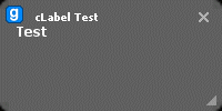
Here's a real quick test to make sure that it works:
cFrame = vgui.Create( "frame" );
cFrame:SetSize( 200,100 );
cFrame:SetPos( 0,0 );
cFrame:PostMessage( "SetTitle", "text", "cLabel Test" );
cFrame:SetVisible( true );


cLabelTest = vgui.Create( "cLabel", cFrame );
cLabelTest:SetSize( 50, 10 );
cLabelTest:SetPos( 4, 20 );
cLabelTest:SetText( "Test" );
cLabelTest:SetAlign( 1 );
You should get something like this:
Button
Code
For the button, you'll notice on the earlier graphic that it derives it's functionality from the label control; Basically, by adding onto the label control, all we're really doing is adding the clickable functionality. Sounds much less daunting, yes?
First, this is how we'll define the button:
cButton = {};

-- Code here


vgui.Register( "cButton", cButton, "cLabel" );
You'll notice that in the vgui.Register function, we added the third argument, which means that we will be basing the control on the label control; So arleady, we've written everything that was already written in the label control, such as the font, text alignment, etc.
Now, let's add the framework for what we're going to be doing:
cButton = {};
cButton.OnMouseDown = nil; -- More on these two later
cButton.OnMouseUp = nil;
cButton.State = nil;
-- States:
-- 0: Idle
-- 1: User is holding down the mouse on this control

function cButton:Init()
  -- onmousedown and onmouseup are still nil.
  self.State = 0;
  self.Text = "Click Me!"; -- For a button, we may as well have a different text.
end

function cButton:Paint()
  return true; -- We don't want the cLabel:Paint() function being called.
end

function cButton:OnMousePressed( m )
end
function cButton:OnMouseReleased( m )
end
Now, what's OnMousePressed and OnMouseReleased? Well, when you click on something, you do two things; You press down on the mouse button, and you let go of the mouse button. In code language, when you press the mouse button down, you get the OnMousePressed event, and when you let go of the mouse button, the OnMouseReleased button is called. If you wanted to act on something after clicking it, you'd use the OnMouseReleased event.
Now, what we want to do, is when the OnMousePressed button is called, we'll set the state to 1, and when the OnMouseReleased button is called, we'll set the state to 0. We will also call the functions that are associated with these.
What functions?
Well, look here:
cButton.OnMouseDown = nil; -- More on these two later
cButton.OnMouseUp = nil;
Well, when the user goes to use the control, he'll do something like this:
myButton.OnMouseDown = function() msg( "Mouse down!" ) end
myButton.OnMouseUp = function() msg("Mouse up!" ) end
Basically, we're assigning a function to these variables. Now, when the button is pressed or released, these functions are going to be called ( if they exist ).
The other thing that you may have noticed, is that we have an argument on our functions, m. This is the MouseCode - it allows us to differentiate between right mouse click and left mouse click. With that, let's fill in these functions:
function cButton:OnMousePressed( m )
  self.State = 1; -- Mouse Down
  if ( self.OnMouseDown != nil ) then
    self.OnMouseDown( m );
  end
end
function cButton:OnMouseReleased( m )
  self.State = 0; -- Mouse Up
  if ( self.OnMouseUp != nil ) then
    self.OnMouseUp( m );
  end
end
So whenever these events are called, we pass that on to the user-assigned function, and we also pass the mouse code, if the user needs to do something different between right and left mouse clicking.
Now, what we need to do is to add the paint function. Now typically, on a button, it is "popped out" when not in use, and when you hold your mouse down on them, they typically "pop in". So, based on self.State, which is either 0 ( not in use ) or 1 ( mouse down ), we'll do two separate things.
function cButton:Paint()
  // Draw Border
  if ( self.State == 1 ) then
    surface.SetDrawColor( 0,0,200,255 ); -- Blue
    surface.DrawRect( 0,0,self:GetWide(),self:GetTall() );
  else // The only other state should be 0, but if it's something else for some weird reason, we still want to draw it.
    surface.SetDrawColor( 200,100,0,255 ); -- Orange
    surface.DrawRect( 0,0,self:GetWide(),self:GetTall() );
  end

  // Draw Inside
  surface.SetDrawColor( 100,100,100,255 );
  surface.DrawRect( 4,4,self:GetWide()-8,self:GetTall()-8 );
  // Draw Text
  // Text, font, x, y, color, align
  draw.DrawText( self.Text, self.Font, self:GetWide() / 2, 3, Color( 255,255,255,255 ), 1 );
  return true;
end
Example Usage
Alright, now for an example.
cFrame = vgui.Create( "frame" );
cFrame:SetSize( 200,100 );
cFrame:SetPos( 0,0 );
cFrame:PostMessage( "SetTitle", "text", "cLabel Test" );
cFrame:SetVisible( true );


cLabelTest = vgui.Create( "cLabel", cFrame );
cLabelTest:SetSize( 100, 25 );
cLabelTest:SetPos( 50, 20 );
cLabelTest:SetText( "Test" );
cLabelTest:SetAlign( 1 );


cButtonTest = vgui.Create( "cButton", cFrame );
cButtonTest:SetSize( 100, 25 );
cButtonTest:SetPos( 55, 35 );
cButtonTest:SetText( "Click Me!" );
cButtonTest.OnMouseDown = function() cLabelTest:SetText("Mouse Down!") end
cButtonTest.OnMouseUp = function() cLabelTest:SetText("Mouse Up!") end
This will create a frame with a label, and a button below the label. When you click the button, the label will change to mouse down, and when you let go, it will say mouse up.
It looks like this:
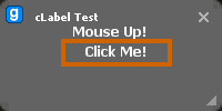
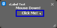
I had to manually add in the pointer on the second one. ( PrintScreen doesn't include pointers ).
